Project
At Open Liberty, I was able to greatly work a team of developers and technical people to contributed different website functionalitites across the website to improve the overall user experiences for the end users.
Goal
Project 1: Enhancing the mental model for Java developers searching Open Liberty documentation by providing deeper, more relevant search results and enabling
Project 2: Improve transparency by smoothly integrating a way for Open Liberty audiences to contribute to the website
Collaborators
Tamara (UX designer), Steve Sam Jacob (IBM Software Developer), Laura Cowen (IBM Technical Content Strategist), David (Technical Writer)
Result
Both designs were handoff for development!
Knowledge Harvesting
Navigating the docs feels harder than it should be without search
To understand the current context of the Open Liberty website and pain-points, we delve into understanding centering user pain-points from the team
Navigating technical documentation, particularly for users who are not deeply familiar with the product or development concepts is difficult because the site search doesn't surface the right pages clearly when someone searches something like “user registry.”
A user might land on an auto-generated page when searching for a configuration element, only to find a short, two-sentence definition with no context, usage examples, or links to related content even though that information may exist elsewhere in a manually written section
Competitive Analysis
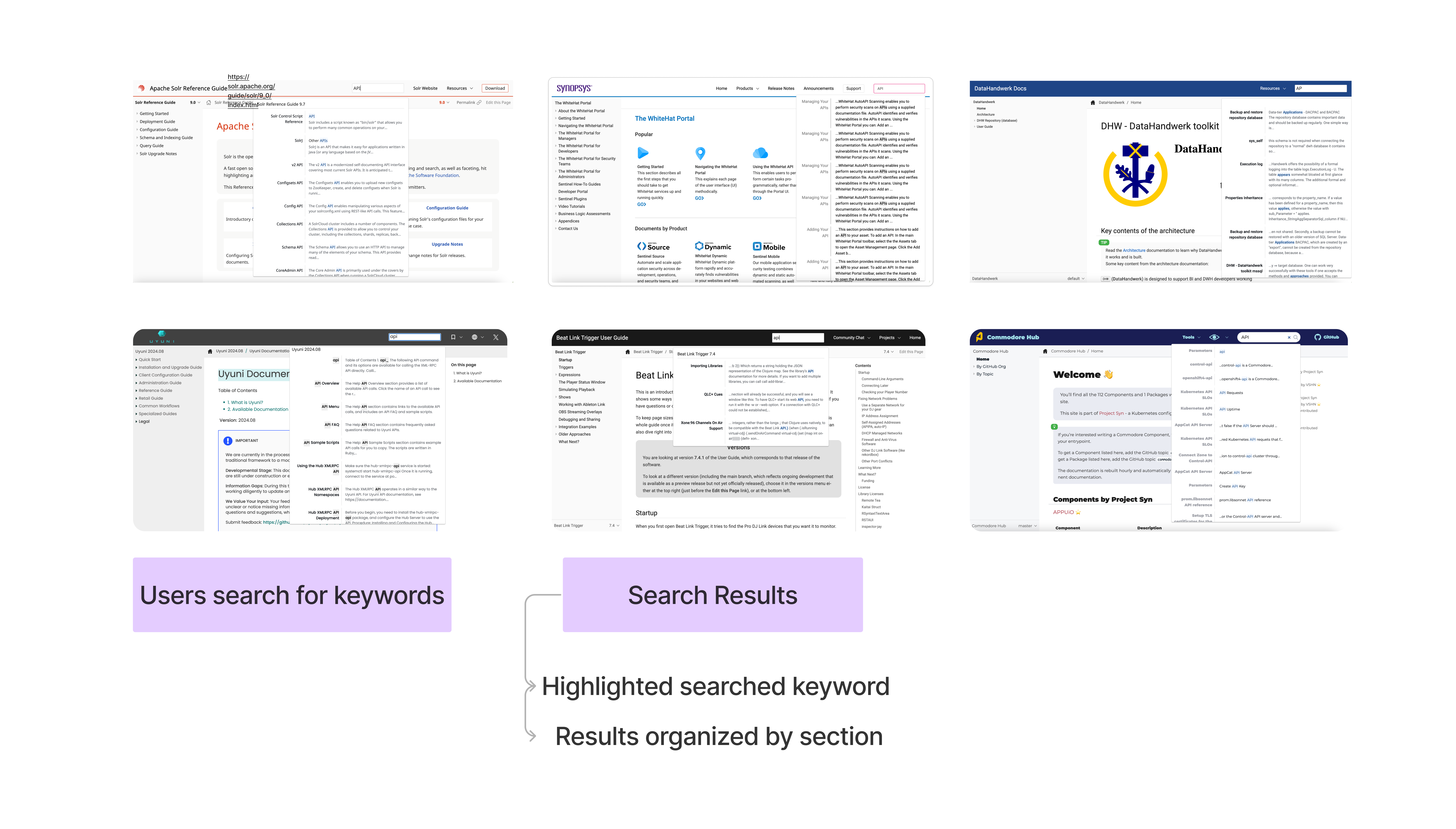
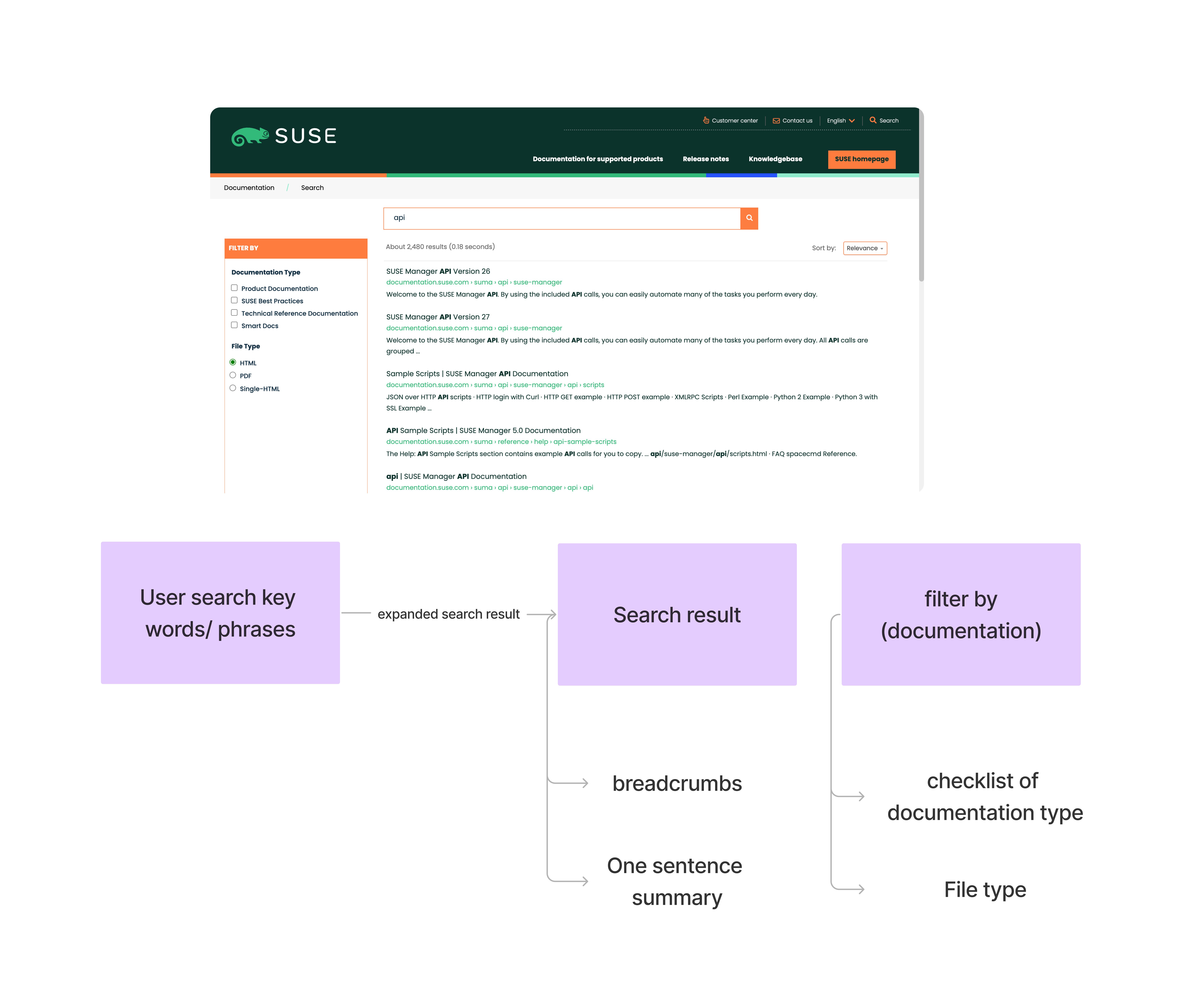
Evaluating Lunr.js Search Capabilities within Antora’s Static Site Limits
We found that Open Liberty faces a technical limitation due to its use of Antora,a static site generator. The challenge is that Antora handles page generation automatically, which makes it difficult to customize or modify individual pages as needed. To work around this, the current idea is to see frontend features that are technically feasible with Lunr.js to set the threshold of what the limtiations
Journey Map
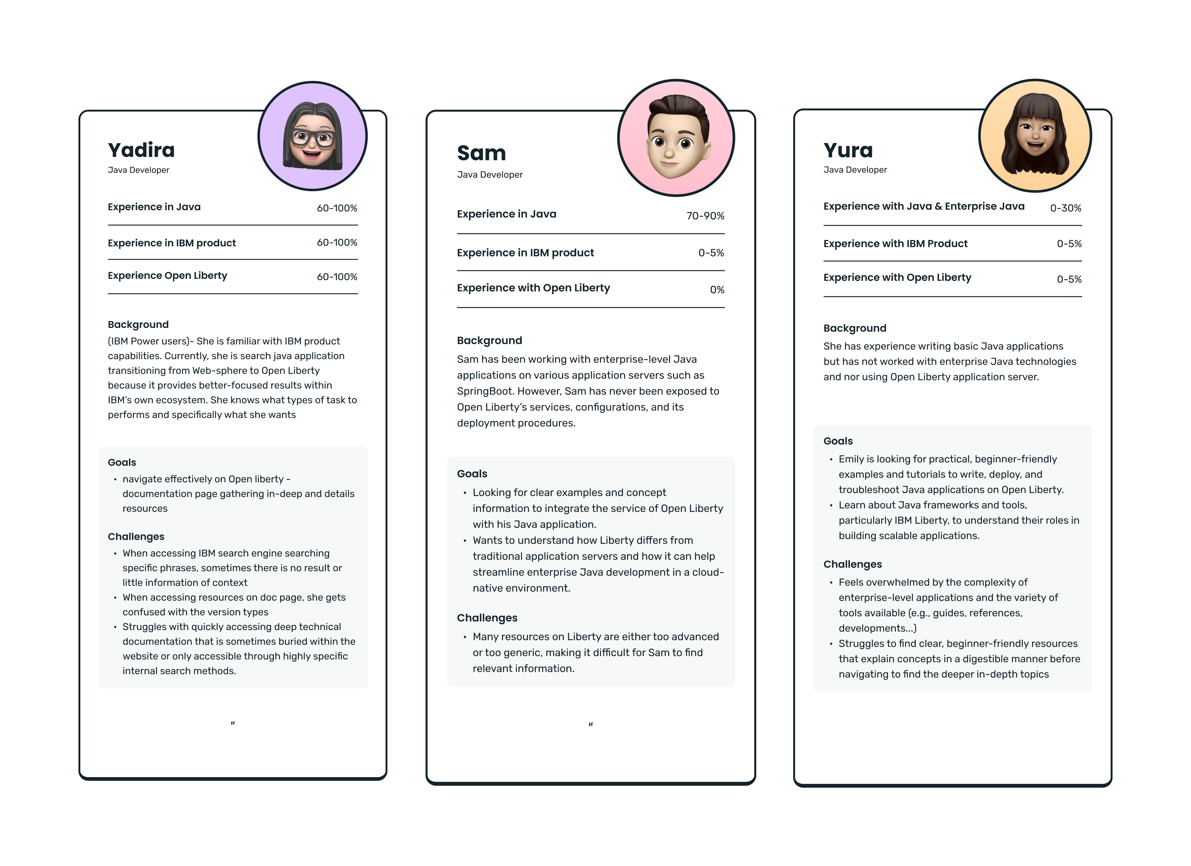
Who are current Open Liberty users?
Knowing how experienced developers are with Open Liberty—or enterprise Java in general helps us design better, more supportive experiences. It shows us how much of the product they’re able to use on their own, and where they might get stuck. This understanding helps us identify who our users really are—from complete beginners who need more guidance and simpler language, to advanced enterprise developers looking for deep technical resources. The gap between these groups is big, and their needs are very different.
Journey Mapping
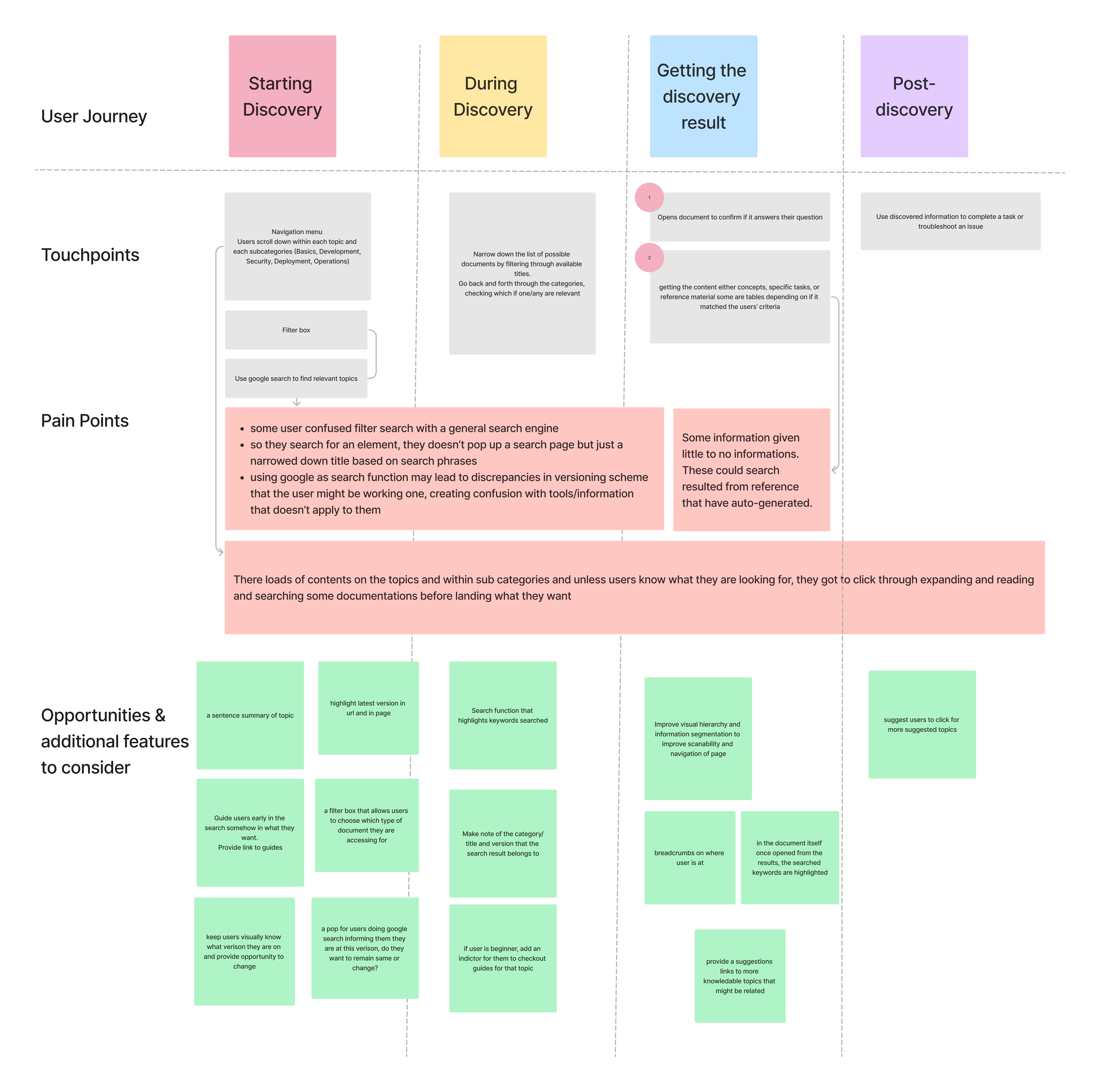
Identifying opportunities through understanding how are users currently navigating the document search journey
Based on the personas, we audited how users navigate the document search within the current website limitations, focusing specifically on the filter and navigation menu. These constraints often prevent users from getting direct results and cause confusion with manual searching. As a result, we identified UI opportunities to improve the way users find documentation.
Design Solutions first pass
Verison 1: Search through the step-by-step content through flexibility
We designed different versions of how the search capabilities will help developers navigate to what they are looking for and user tested with different Ibmers users (6) from developers (java and information) to internal technical account manager. We were able to identify that most users prefer to be allowed to explore the content step by step rather than being bombarded with too much information at once.
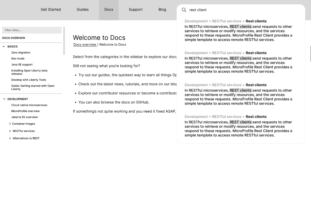
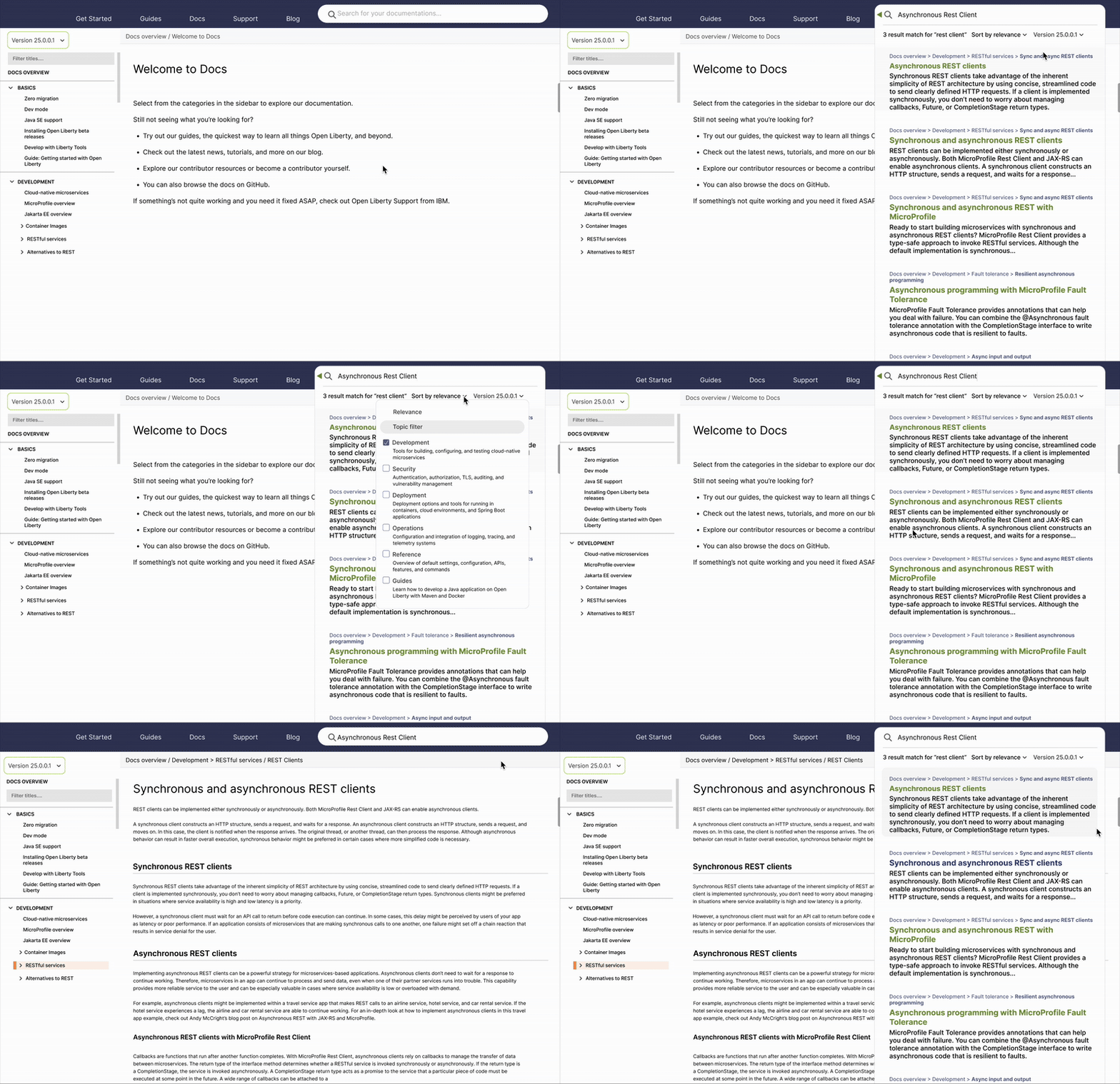
This design allows users to search key words and the result will popup the direct documentation of those words in each of the documentation filtered by relevance that appears in higher hierarchy

A key piece of feedbacks came from Steve, our project manager and lead developer, who believes this design is the most technically feasible from our Luna.js web standpoint. The backend follows a specific template structure defined by that codebase. We led to conclusion to design a no-brainer and ideal version
Software Developer Lead for this project
with addition of filters that surface deeper, more precise documentation

This design allows users to filter topic filter and version control inside to get more granular details
Version 2: Deliver more meaningful search results using subtitle cross-references

This design allows users see quick glances of the context of the documentation page based on subtitles. By specifically providing subtitles, it allows developers and end-users to scanning and cross-referencing more easier
Additional UI: Alert verison change for newest documentations changes
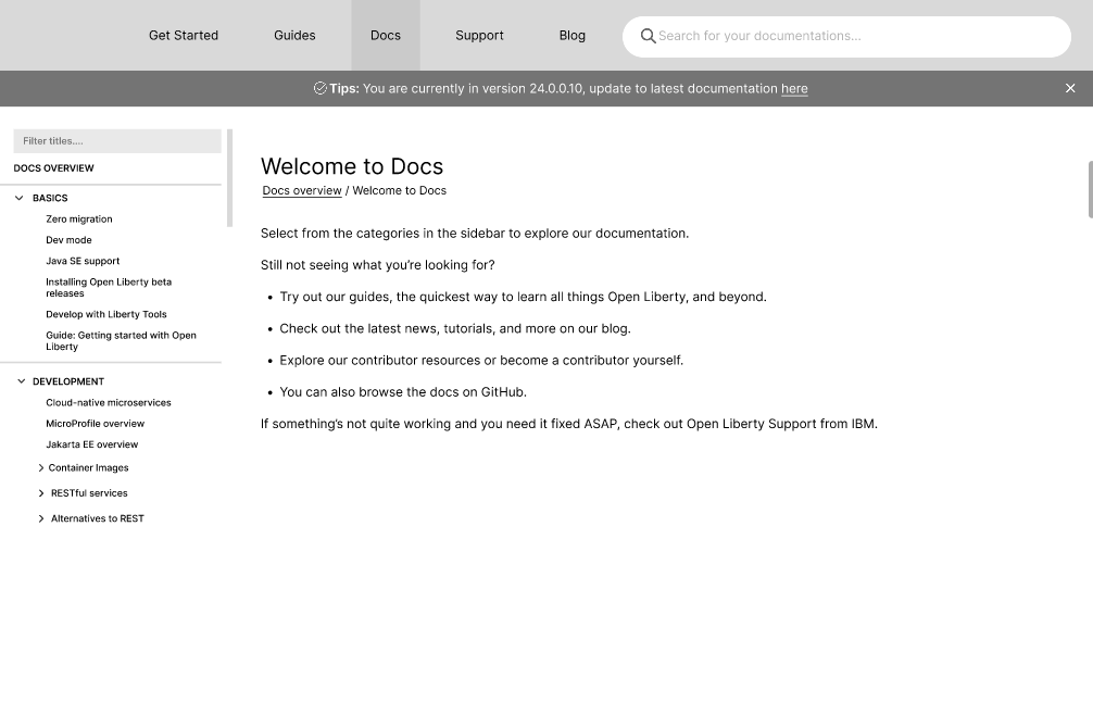
A key pain point was sometimes users end up in older documents, thus there will be version alert if they want to update to the newest one.
Using outdated documentation can lead to implementing deprecated methods, misconfigured APIs, or missing critical updates. Alerts help developers avoid mistakes.
Final Design solution (No Brainer)
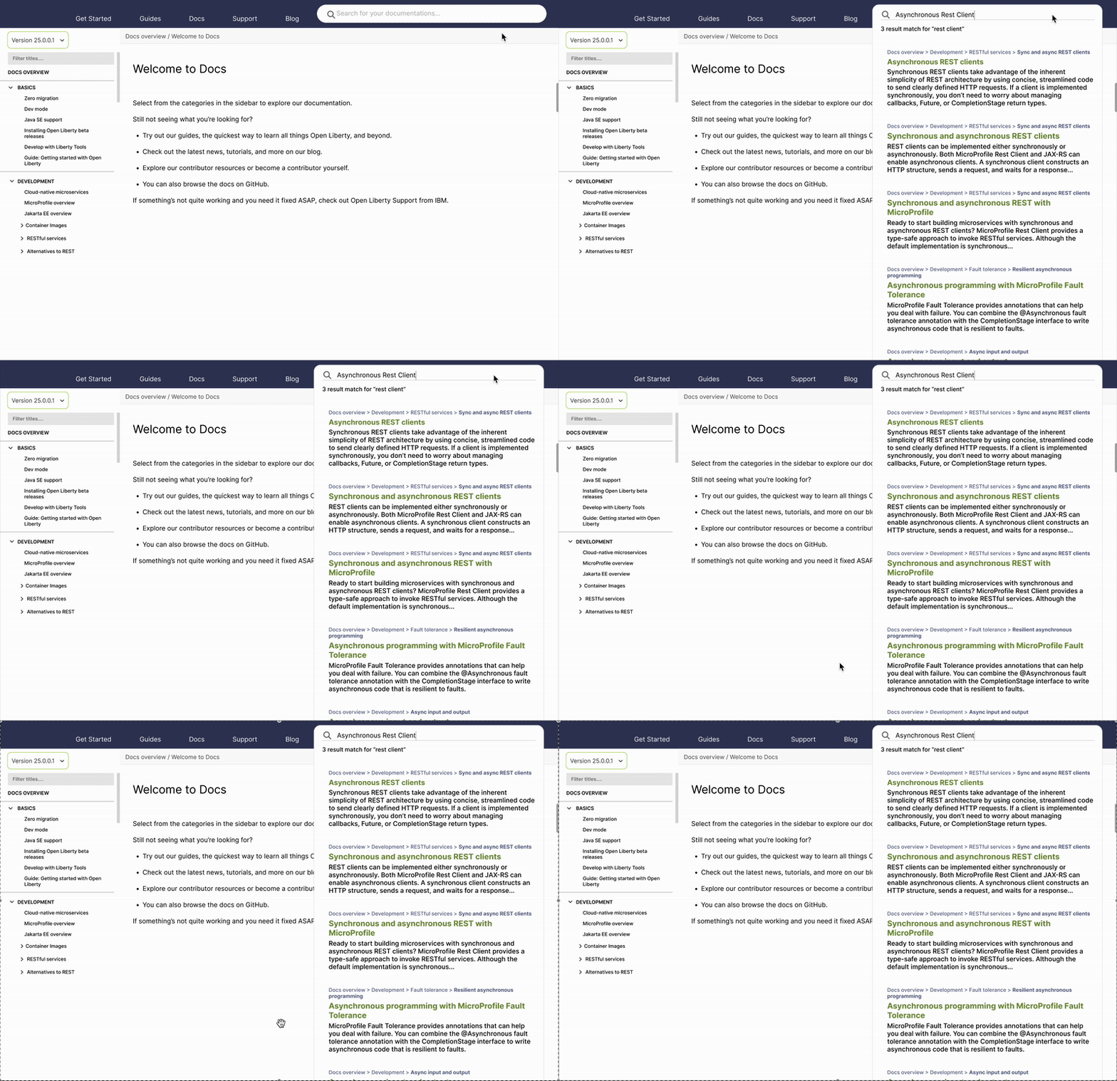
User research reveal that different levels of users struggled with slow search processes and difficulty digesting content. In response, we proposed a lightweight integration of search into the existing Open Liberty platform, designed to return keyword-focused results that are fast to read and easy to understand.

Bread crumbs that allows break down the documentation into clear, hierarchical steps, allowing users to jump directly to the specific section they need without losing context.

Main titles with popup color to draws immediate attention to the most important information

Showing a short text snippet where the keyword appears in the document gives users quick context for why that result is relevant.
Final Design solution (Ideal)
We proposed that the search ideally include the following feature aids to help users refine their searches more precisely, quickly, and accurately.

Showing search history

Showing top keywords that is popular search from users of OL docs

Users can filter results by relevance through keywords and/or topics. User testing revealed that some participants were unclear about the meaning of “topics,” so we included a brief description for clarity. This update mainly supports new Open Liberty users, as power users are already familiar with the terminology.

Version change within seach result

When a search result has already been clicked, it changes to a different color to indicate it has been visited.
